

The Era of Dark Mode: A Non-Negotiable UX Standard for 2024
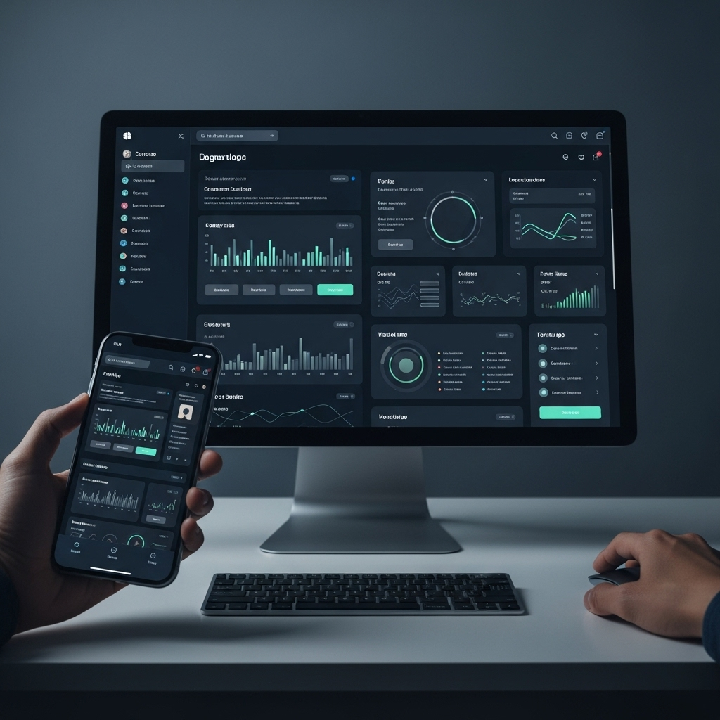
In the rapidly evolving landscape of digital design, staying ahead means understanding and adapting to user preferences. One trend has transcended ‘preference’ to become a fundamental expectation: Dark Mode. What was once a niche option is now a critical component of a thoughtful user experience, especially across mobile and desktop interfaces.
The numbers speak for themselves. A compelling Statista 2024 survey reveals that a staggering 82% of smartphone users now actively rely on reduced-brightness layouts to minimize eye fatigue. This isn’t just a fleeting fashion; it’s a clear signal from users demanding comfort and accessibility in their daily digital interactions. For designers and developers, adopting dark mode isn’t just good practice—it’s essential for delivering a modern, user-centric experience.
Why Users Are Embracing Dark Mode
The widespread adoption of dark mode is driven by several tangible benefits for users:
- Reduced Eye Strain: Prolonged exposure to bright screens can lead to digital eye strain, headaches, and dry eyes. Dark mode, with its lower luminescence, significantly alleviates this discomfort, especially in low-light environments.
- Improved Sleep Quality: By minimizing blue light emissions, dark mode can help regulate melatonin production, potentially leading to better sleep patterns for users who interact with screens late at night.
- Battery Efficiency: For devices with OLED or AMOLED screens, dark mode can lead to substantial power savings, as black pixels consume less energy than white ones. This extends battery life, a crucial factor for mobile users.
- Enhanced Aesthetic & Focus: Many users find dark interfaces visually appealing, offering a sleek, sophisticated look. It can also help reduce screen glare and improve content focus by making foreground elements pop.
- Accessibility: For users with visual impairments or light sensitivity, dark mode provides a more comfortable and readable interface.
Integrating Dark Mode Effectively into Your Design Strategy
Implementing dark mode goes beyond simply inverting colors. A truly effective dark mode experience requires careful consideration:
- Semantic Colors: Define a clear color palette for both light and dark modes, ensuring that colors maintain their meaning and emotional resonance across themes. Avoid pure black and pure white; instead, use dark grays and off-whites for better contrast and less harshness.
- Test Across Devices: Ensure your dark mode renders correctly and beautifully on various screen types and sizes, from smartphones to large desktop monitors.
- User Choice is Key: Always provide an easy-to-find toggle or automatic system setting integration that allows users to switch between light and dark modes based on their preference or device settings.
- Maintain Contrast Ratios: While reducing brightness, it’s crucial to maintain sufficient contrast for readability. Tools can help ensure your text and UI elements meet accessibility standards.
Looking Ahead: Dark Mode’s Enduring Impact on UX
As digital consumption continues to grow, so does the demand for user interfaces that prioritize comfort, functionality, and aesthetic appeal. Dark mode isn’t a fleeting trend; it’s a foundational element of contemporary UI/UX design. By making it a standard in your development process, you’re not just following a trend—you’re demonstrating a commitment to a superior, more accessible, and more user-friendly digital experience for everyone.